Warm white vs Cool white: Which holiday light temperature is right for your home?
Choosing Christmas lights used to be simple: you picked a color, plugged them in, and hoped half the strand didn’t burn out. Today, the world of holiday lighting feels more like interior design – Kelvin temperatures, LED diodes, and color consistency all matter if you want your home to look polished, elegant, and intentional.
And no decision stirs more debate than this one: Warm white or cool white?
On Long Island, where holiday lighting is practically a neighborhood sport, these two tones create completely different moods. Warm white brings that timeless, classic glow you see in nostalgic Christmas movies. Cool white gives you a clean, modern, winter-wonderland look the second the sun goes down.
Both are beautiful when done right. But one might fit your home better than the other.
This guide breaks it all down with clarity, style, and a bit of design psychology. Whether you're planning your own Christmas lighting installation or considering hiring a professional for your Long Island home, this article will help you choose the right white – and avoid the lighting mistakes that instantly cheapen a display.
What are warm white Christmas lights? (2700K–3000K)
Warm white holiday lights sit between 2700K and 3000K on the Kelvin scale. If you’re not familiar with Kelvin temperature, think of it like this:
Lower Kelvin = warmer, cozier light
Higher Kelvin = cooler, whiter, or bluer light
Warm white is the glow you associate with:
Candlelight
Vintage incandescent bulbs
Classic New England Christmas aesthetics
Cozy indoor holiday gatherings

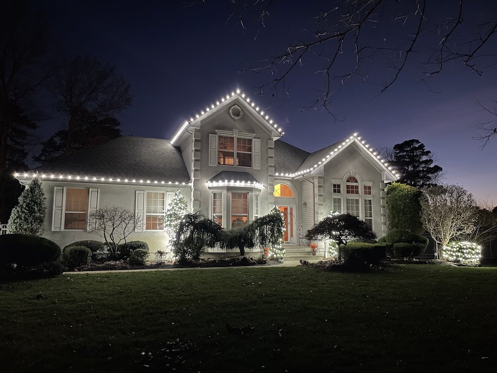
Location: Rockville Centre, NY.
It’s soft, inviting, golden, and instantly nostalgic. On Long Island, especially in neighborhoods with traditional architecture, warm white is the go-to choice because it pairs naturally with:
Colonial homes
Cape houses
Tudors
Stone façades
Wood-trimmed exteriors
Brick homes
Properties with warm landscaping colors (evergreens, mulch, stonework)
Warm white is also incredibly forgiving. Even when used generously, it never feels harsh or overpowering.
When warm white works best
Choose warm white if you want:
A timeless, movie-scene Christmas look
A soft, golden glow that flatters natural materials
A cozy, romantic feel
A uniform look across large areas like rooflines, peaks, and bushes
If your home has a lot of warm undertones, warm white will feel effortlessly cohesive.
What are cool white Christmas lights? (3500K–4500K)
Cool-white Christmas lights typically fall between 3500K and 4500K, depending on the manufacturer. That range is wider than most homeowners realize, which is why cool white varies so much from brand to brand.
Some cool white lights look crisp and neutral. Others lean icy blue.
And some (usually cheaper versions) look almost purple.
Cool white creates a bright, contemporary look that feels:
Clean
Sleek
Snowy
High-contrast
Modern
This style pairs beautifully with:
New builds
Modern homes
Stucco exteriors
Grays, blacks, whites, and cool-toned trim
Sleek landscaping
When installed professionally, cool white makes the house look like it’s glowing from within – sharp, luminous, and unmistakably modern.
When cool white works best
Choose cool white if you want:
Strong visibility from far distances
A crisp, winter-wonderland effect
A modern aesthetic
Lights that photograph brilliantly at night
A more “chic holiday display” versus a nostalgic one
Cool white turns any home into a statement, especially on clean architectural lines.
How Kelvin (K) temperature affects your holiday lighting aesthetic
Most homeowners underestimate how dramatically Kelvin temperature affects Christmas lights. But the truth is:
Color temperature is the difference between a display that looks premium and one that looks mismatched or accidental.
Here’s how different Kelvin ranges feel visually:
2700K: cozy, golden, soft
3000K: warm, elegant, slightly brighter
3500K: crisp neutral white
4000K: cool white with a clean daylight effect
4500K: icy, modern, slightly blue

Since Kelvin directly influences mood and visual harmony, choosing the wrong temperature can actually clash with your home’s exterior.
That’s why professional holiday lighting installers pay close attention to Kelvin – even within the same category. Not all “warm whites” look the same, and not all “cool whites” behave consistently.
Why Kelvin matching matters more than people think
One of the biggest issues in holiday lighting displays, especially DIY ones, is inconsistent Kelvin temperatures. Check out our blog “DIY vs professional Christmas light installation on Long Island: What homeowners need to know” to to understand how quality, consistency, and professional-grade materials make a noticeable difference in the final look of your display.
Because different suppliers label lights differently, two strands labeled “warm white” can be:
2700K vs 3000K
Golden vs champagne
Soft vs bright
Even slightly green or pink-tinted, depending on the diode.
This results in rooflines where one peak looks buttery warm and the next looks nearly white.
It’s subtle during the day. It’s extremely noticeable at night.
Long Island neighborhoods have high visibility – homes sit close together, and your display is competing with every house on the block. When the temperatures don’t match:
The display looks pieced-together
The roofline looks uneven
The home loses that high-end, intentional feel.
Professionals avoid this issue by sourcing from premium manufacturers that offer consistent Kelvin temperatures year after year.
Why you shouldn’t mix warm white and cool white
Some homeowners try mixing warm white and cool white intentionally, thinking it will create “contrast” or an “accent look.”
In reality? It almost never works.
Why:
The tones compete with each other
Warm white leans golden
Cool white leans blue
Together they fight visually, not blend
Your eye doesn’t know where to focus
It reads as a mistake, not a design choice.
Even when both are technically labeled as “white,” the difference in Kelvin makes the display look disconnected.
On commercial properties or big public displays – where scale is huge, and the design is artistic – you can sometimes get away with mixing. But for residential homes?
Consistency is everything.
Most premium lighting designers recommend choosing one tone and committing to it across:
Rooflines
Bushes
Trees
Pathways
Wreaths
Garland
Window outlines
This creates a visual flow that looks intentional, elegant, and grounded.
Design psychology: How light temperature changes the way your home feels
Light isn’t just decoration; it’s a feeling. And during the holidays, emotion is a huge part of the experience.

Location: Holbrook, NY.
Warm white feels:
Comforting
Familiar
Traditional
Cozy
Safe
Magical in a nostalgic way
Warm white makes homes feel lived-in and welcoming. It’s the lighting equivalent of fresh cookies or a fireplace.
Cool white feels:
Clean
Modern
Sparkling
Sleek
Energizing
Winter-chic
Cool white gives your home a luxury-boutique look – bright, crisp, and photo-ready.
Understanding how you want guests (and yourself) to feel when you approach your home helps guide the decision.
How to choose the right light temperature for your Long Island home
Here’s a simple way to choose:
Choose warm white if:
Your home is traditional, coastal, historic, or rustic
You want a welcoming, classic holiday look
Your exterior has warmer undertones—brick, stone, beige, wood
You want the display to feel soft and charming
Choose cool white if:
Your home is modern, renovated, or has clean lines
Your exterior uses whites, blacks, grays, or cool stone
You prefer a sleek, brilliant nighttime effect
You want a “showpiece” look that stands out sharply
And if you’re torn?
Warm white tends to appeal to the widest number of homeowners – it’s timeless and never feels harsh.
Installation tips for the best holiday lighting results
1. Keep Kelvin consistent
Whether you're installing roofline lights or wrapping bushes, use the same Kelvin temperature everywhere.
Consistency = premium, polished, professional.
2. Stick with one supplier
Mixing manufacturers usually means mixing slightly different temperatures, even within the same color category.
3. Match temperature to architecture
Cool white on an old brick colonial often feels off.
Warm white on a stark modern home can feel dull.
Think harmony, not trend.
4. Test lights before installation
Line up a few strands indoors or in the garage and check:
Does one lean yellow?
Does one lean blue?
Do they flicker differently?
Your eye will catch inconsistencies immediately.
5. Choose LED over incandescent
LEDs hold color better, last longer, and stay consistent across seasons – important when Kelvin matters so much.
6. Evaluate from the street
Step back 20–30 feet and make sure the light color looks uniform across peaks, windows, and bushes.
7. Avoid combining warm and cool
Even if you think you can make it intentional, it almost always reads as mismatched.
Choose one. Commit.
Final thoughts: Which one is right for you?
There’s no “better” choice, just the right one for your home’s style, your personality, and the feeling you want during the holidays. Warm white gives you a timeless, classic look that feels cozy and nostalgic. Cool white offers a modern, crisp, upscale aesthetic that stands out instantly.
Both can elevate your home beautifully… as long as you're consistent with color temperature and choose high-quality LEDs.
If you're in Nassau County or Suffolk County and want a Christmas display that feels polished, intentional, and professionally designed, we can help you choose the perfect Kelvin temperature and install a display that looks flawless all season.
Contact us today to connect with a lighting designer and turn your vision into a festive reality.